Becoming a meal-kit chef
Reducing hesitation in high-intent journeys through better-timed trust signals
B2C subscription product | High-traffic acquisition funnel | Experimentation | Persuasion | Social Proof Architecture | Behavioral Experimentation
Context. Behavioral design in a high-traffic acquisition funnel at HelloFresh, focusing on early user engagement
Business goal. Reduce drop-offs during sign-up
Scope. Reduce exploratory drop-offs by architecting trust signals around user decision stages
My role. Product Designer in the Growth team. Led UX strategy, prototyping, UX/UI design, and A/B testing in collaboration with product managers, engineers, UX writers, and data analysts.
Outcome. Redesigned key acquisition touchpoints to align trust signals with decision stages, generating €11M+ revenue impact across multiple markets.

Problem Area
HelloFresh provides weekly meal-kit boxes with pre-measured ingredients and personalized recipes.
Despite steady acquisition traffic, a significant portion of prospective users dropped off during the exploratory phase.
Behavioral analysis revealed that approximately 40% of users exited before completing exploration, and 42% abandoned the process at registration. Many navigated back to earlier pages, suggesting unresolved hesitation rather than rejection.

This indicated unresolved hesitation rather than lack of product appeal.
Users were pausing at moments where trust signals did not align with their decision stage.
Deeper look
To understand this hesitation, we combined product analytics, surveys, and exploratory journey walkthroughs.
We found that 48% of user questions emerged before decision-making, primarily around long-term fit and lifestyle implications.
Users sought reassurance, but traditional persuasive elements such as testimonials were often ignored when they appeared out of context or disrupted task flow.
The friction did not stem from low intent, but from poorly calibrated trust signals.
Users needed tangible, stage-appropriate cues that clarified value and reduced hesitation.
Building strategy
User insights pointed to trust and motivation as the core levers.

We developed a persuasion framework grounded in three principles to support user’s trust and motivation. We treated them as stage-dependent design variables that required calibration across the journey:
Timing
Matching trust signals to the user’s decision stage
Tangibility
Replacing abstract claims with concrete, relatable proof
Focus
Removing persuasive clutter that competes with task completion
Solution
We recalibrated how and when proof was introduced, shifting from increasing persuasive intensity to aligning persuasion with user intent.
UI visuals have been modified and anonymised to protect confidential work.
The interaction patterns and design decisions shown reflect the shipped experience.
Framing long-term experience at entry
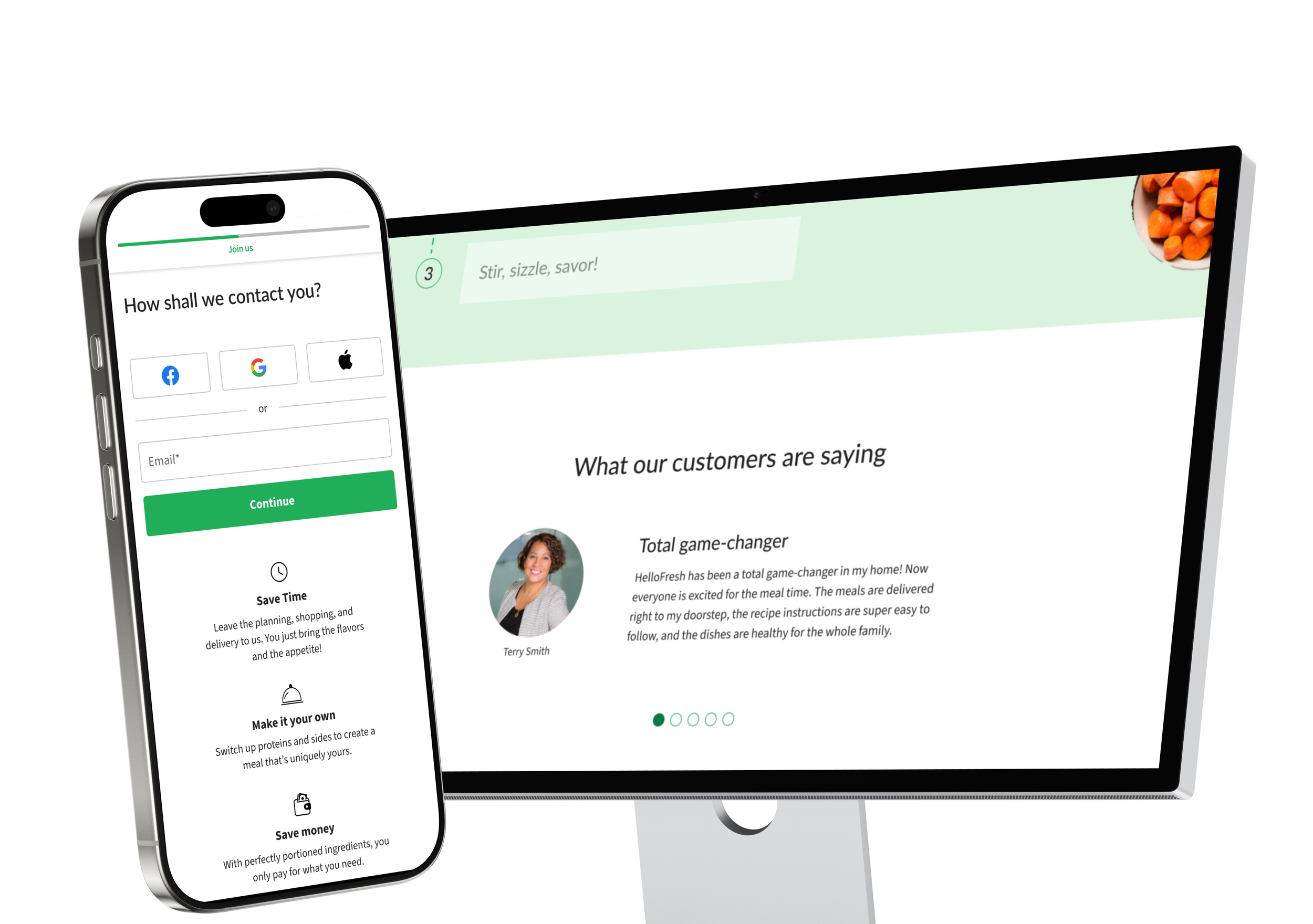
On our landing pages, we replaced generic testimonials with concise, user-generated content that demonstrated real-life outcomes.
Experiments tested different ordering of sections, how images were shown, and whether the user interface was static or dynamic.


Supporting commitment
At registration, we introduced contextual social proof that reinforced momentum without distracting from task completion.
Experiments tested removing existing sections and using different social proof content, such as the number of users and boxes, during various time periods.


Tangible lifestyle outcomes
During exploration, we translated abstract value propositions into concrete, lifestyle-based outcomes that users could immediately relate to.
Experiments tested different type of content and interaction patterns.

Adoption
Aligning trust signals with decision stages resulted in measurable business impact.
€11M+
in revenue
4+
countries
3
brands
The persuasion framework was later applied to reactivation and retention flows, where calibrated trust signals helped address hesitation at moments of cancellation and return.